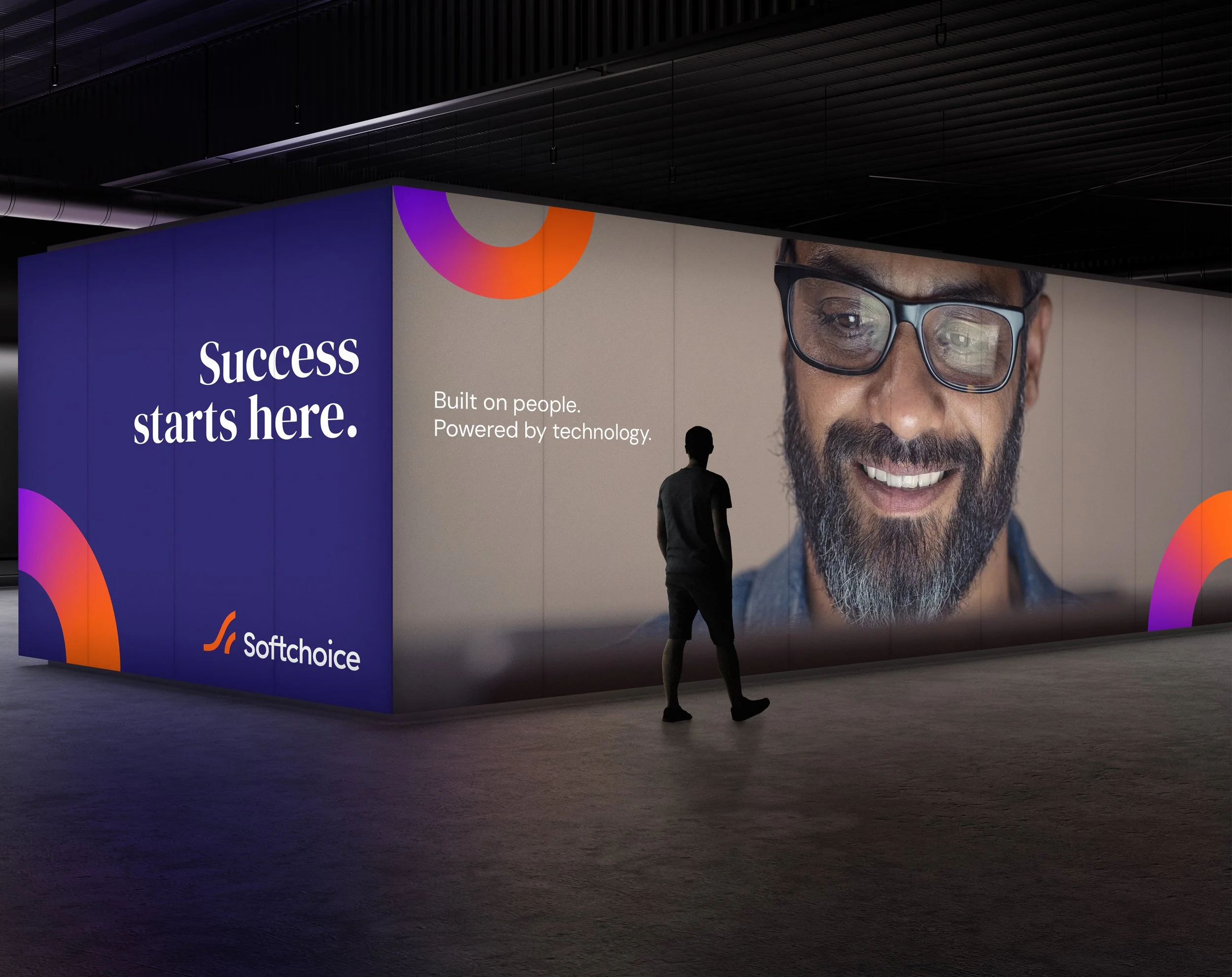
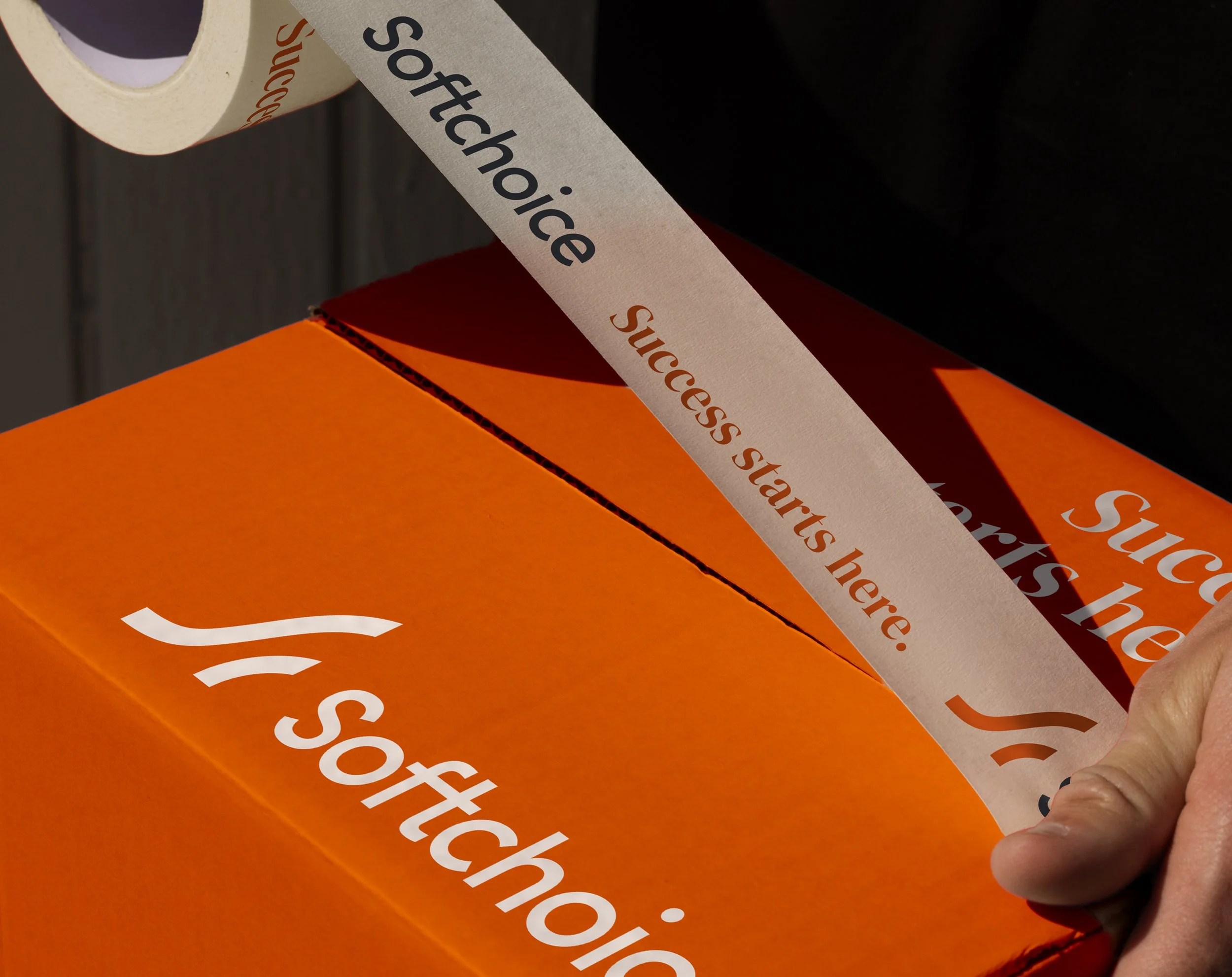
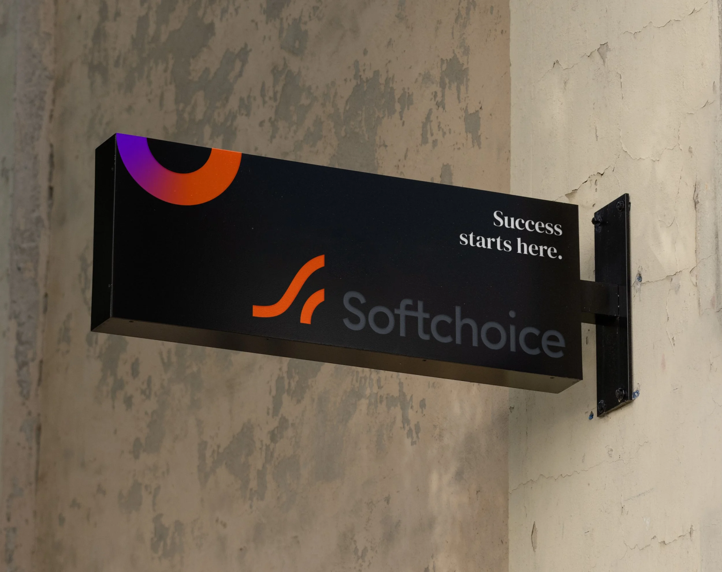
A rebrand created to bring clarity and warmth to a complex technology category. The work reframes enterprise IT through a more human lens, positioning Softchoice as a partner focused on collective success and long-term relationships.
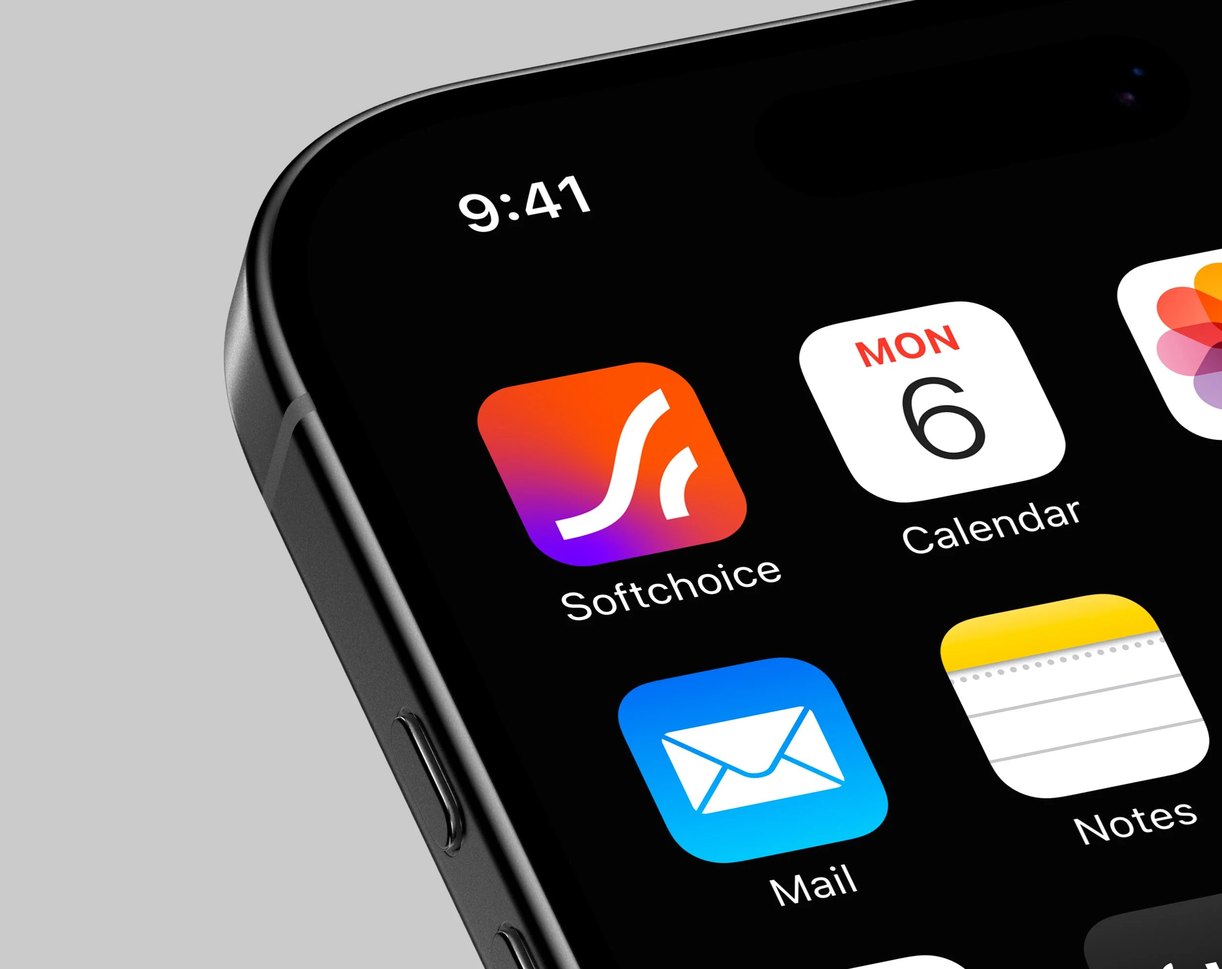
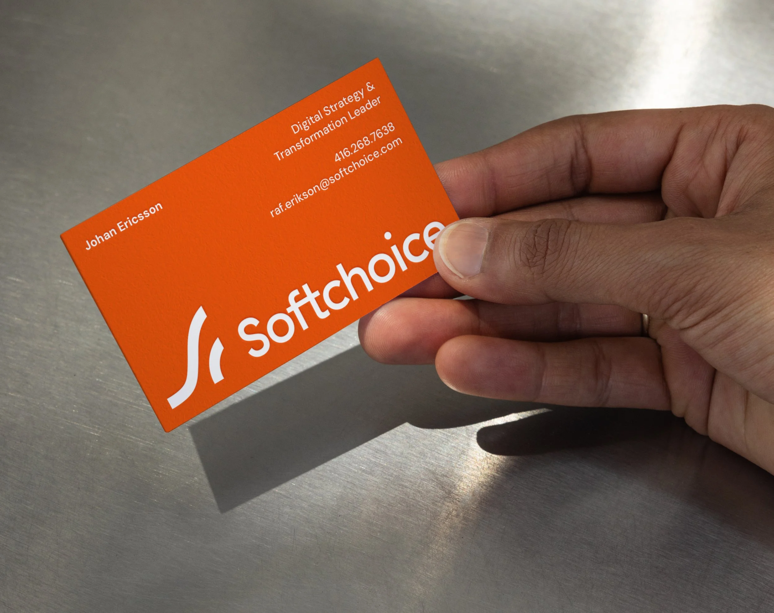
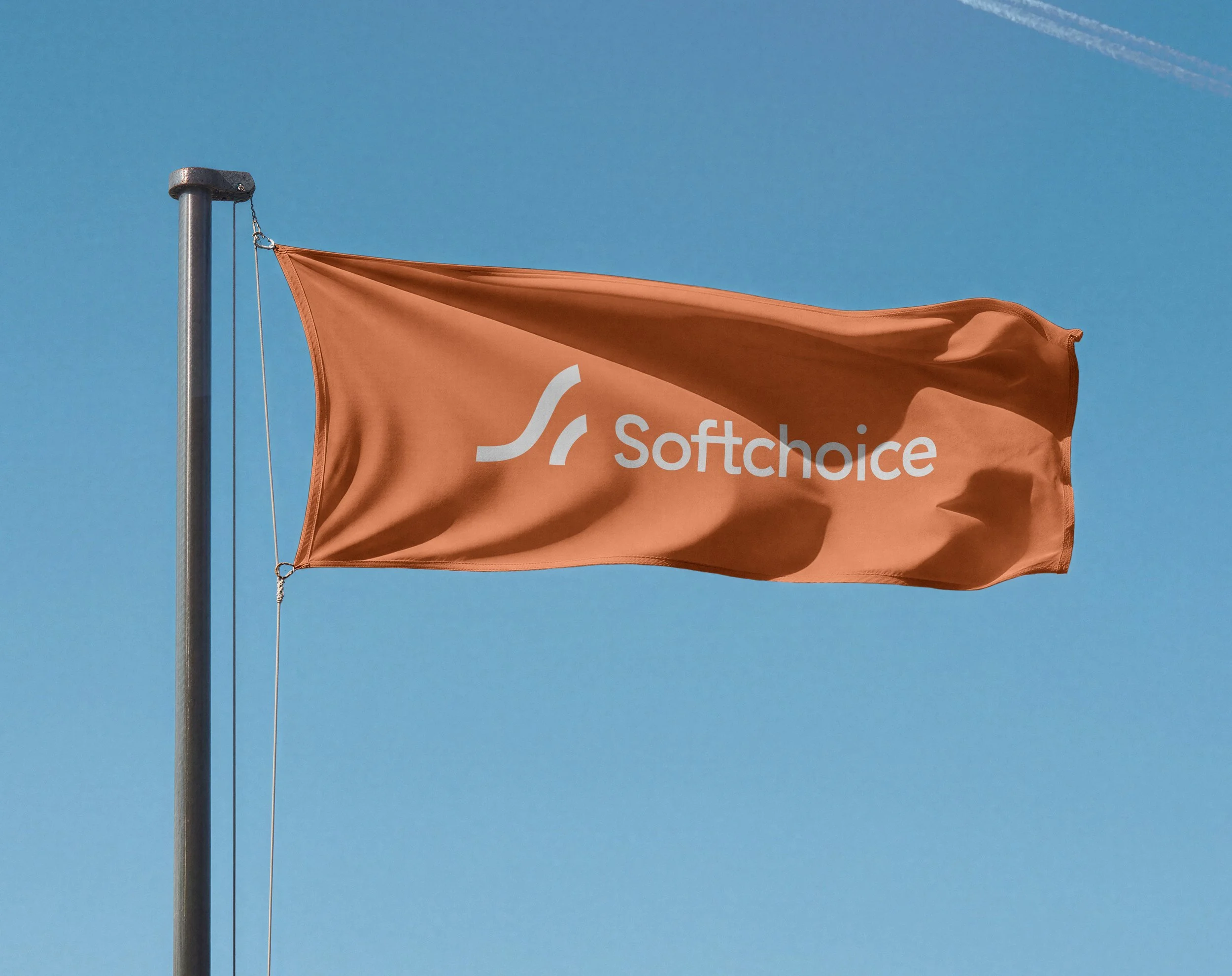
The identity balances technical confidence with approachability. A wave inspired symbol conveys momentum and progress, supported by a flexible visual language that combines vibrant colour, considered typography, and expressive motion.
The result is a modern brand system that humanizes technology, bringing cohesion and optimism to how Softchoice shows up across consumer and business touchpoints.